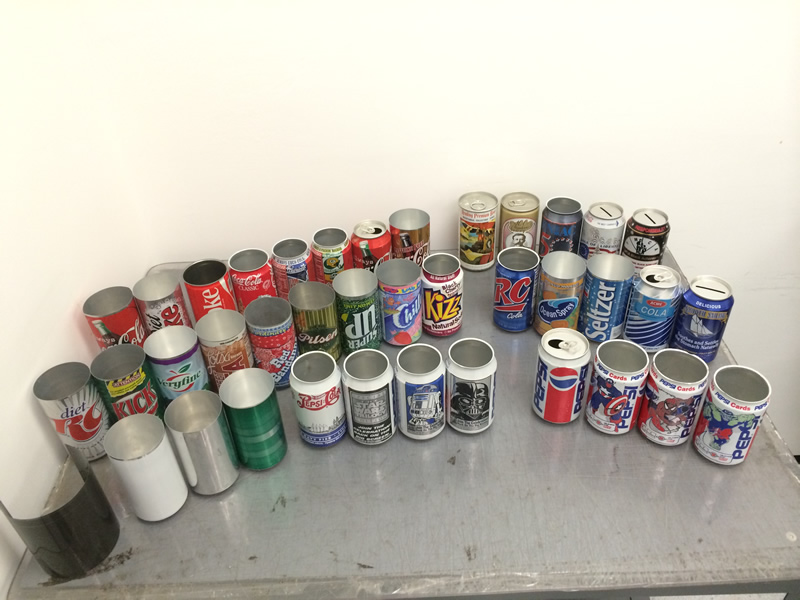
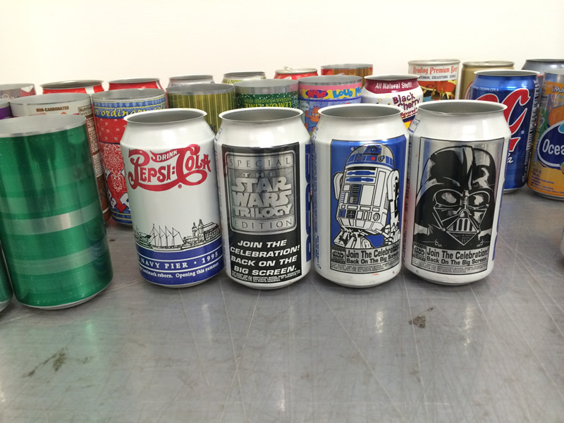
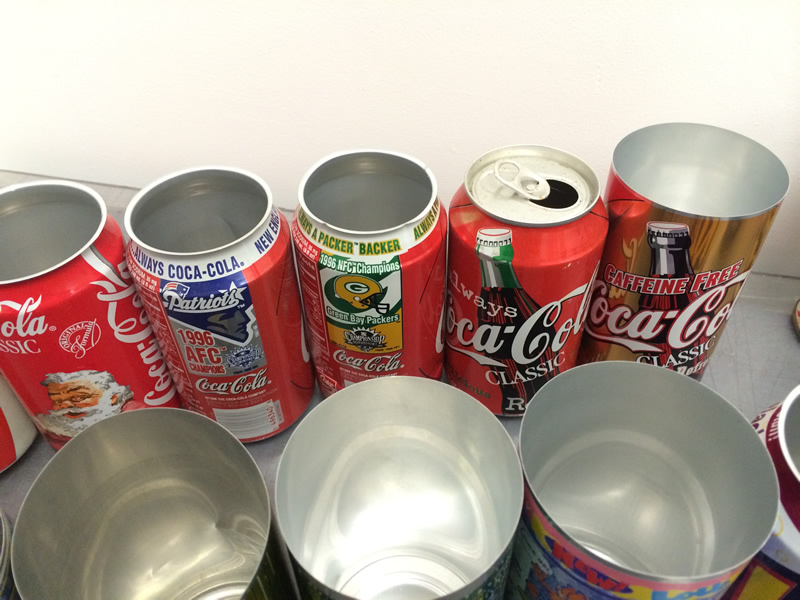
We had the pleasure of interviewing Paul Adler, a former employee of Crown, Cork, and Seal to give us a look at can design and production from someone who was actually involved in the printing process at one of the world’s leading beverage can manufacturers. For more information on Paul and if you ever find yourself in the Philly area, check out his 1980's Hard Rock Tribute Band,
Old School. For more information about the can manufacturing process, check out this PDF,
How a two-piece drawn and wall-ironed drinks can is made by Metal Packaging Manufacturers Association. This is an interesting video,
How It's Made Aluminum Cans (Sam's Club Choice) by Discovery / Science Channel. Finally, here is a video about Coca-Cola cans,
How its made, coca cola part 2. by National Geographic Channel.
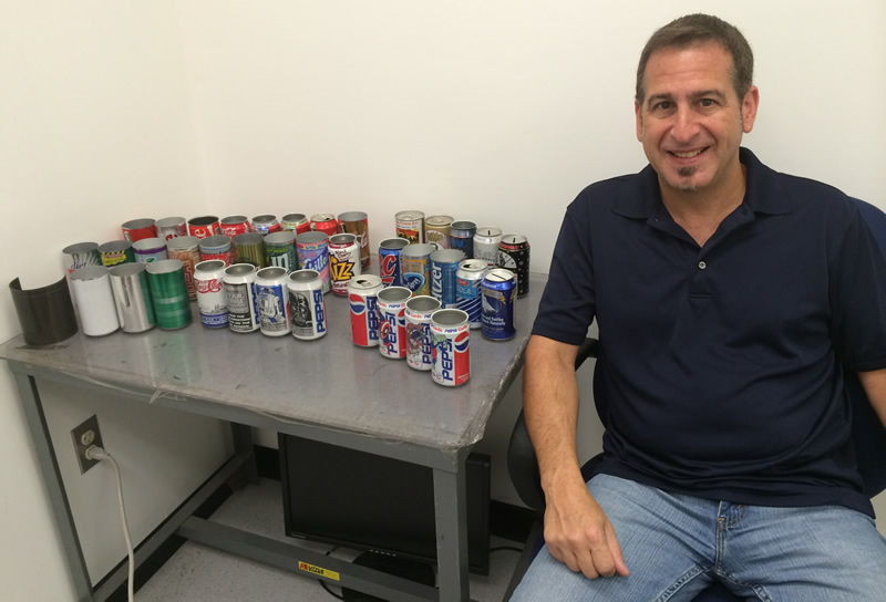
CanMuseum.com: You worked at the Crown, Cork, and Seal company, right?
Paul Adler: Yes.
CanMuseum.com: What was your title and role there?
Paul Adler: Well, I started as a proofreader and I advanced to graphics coordinator and then purchasing agent for the the plant I worked for. The department was up by the computers when we needed computers and stuff like that with no knowledge of said things. I coordinated artwork to go through for pre-press.
CanMuseum.com: As far as I know, and correct me if I am wrong, The Crown, Cork, and Seal Company is one of the top manufacturers of beverage cans?
Paul Adler: They were. I don’t know what their status is now.
CanMuseum.com: And they make cans for just the United States or all around the world?
Paul Adler: All over the world.
CanMuseum.com: Can you go over some of the process of what you had to do with the can designs and the graphics?
Paul Adler: I did pre-flighted art. Art would come in and I would make sure it was correct, similar to what I do at my current job. There are only four print stations - at least there were in those days - in the presses. So, you can only see four colors. So this is all done, everything you see on a can, a beverage can, typically is only four colors. It goes in one end of the press as a roll of aluminum and it comes out of the other end as a printed un-necked can.
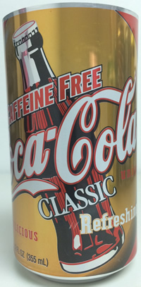
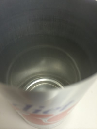
We would get the artwork in and analyze it. Take a look at it and make sure it was at four colors. Then for me the process was called “Reverse Trapping”. On some cans you use the same plates over and over. The only thing that would change is the bottler’s address.
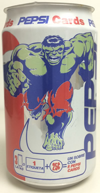
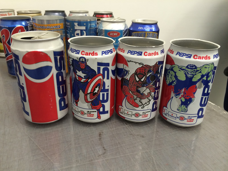
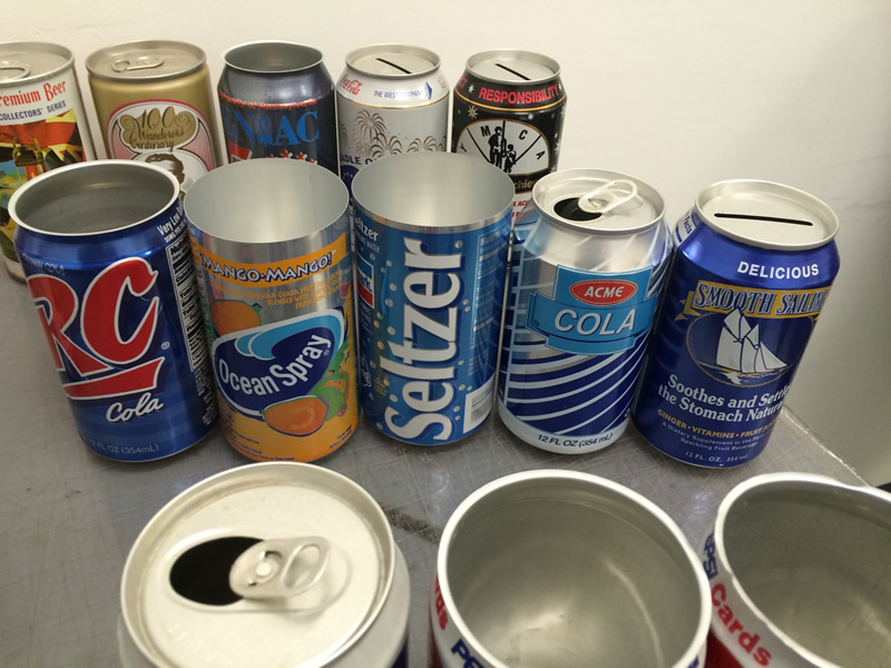
On this Pepsi can, is a blue and white address. The blue plate and the white plate would change, but the red would stay and the green here would stay. There is a green Hulk on this can so those two plates would stay on the press regardless of the canner. Now these were printed all over the country so there were different bottlers. Some plants may print only for one bottler, so they would just print the same can over and over and over. At other plants, they may print for multiple bottlers, so they would be switching plates in and out for that bottler to fill their order.
To get back to reverse trapping, reverse trapping is no two colors should touch in a DNI press. That’s what these were printed on and drawn through an aluminum press. That’s the process of making a can from a roll of aluminum. If you’ll notice it's real obvious in this can that they’ve done what they call a “reverse trap” or “stay-away” and the colors don’t touch. There’s a little keyline of silver around everything.
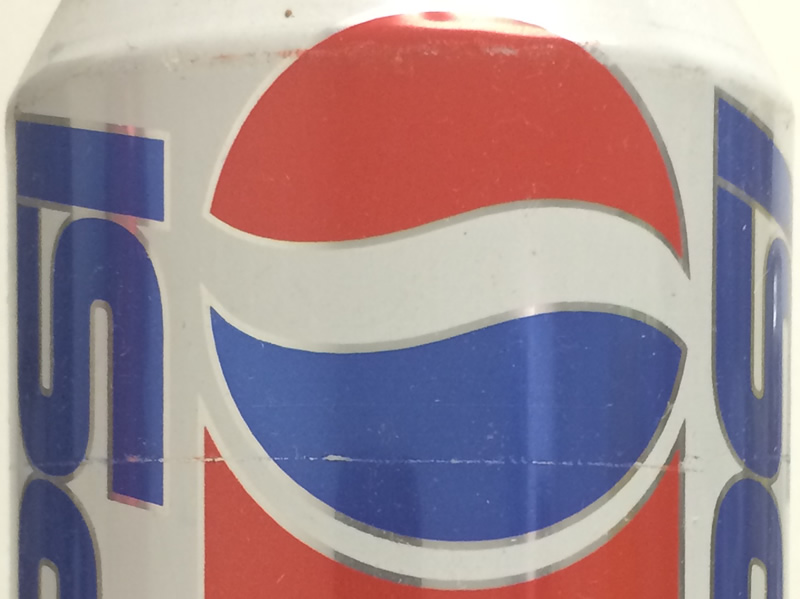
That’s to prevent ink contamination. This ink is made with like “taffy” material and it never dries, is what i’ve been told.
CanMuseum.com: Really?
Paul Adler: Yeah, it’ll stay tacky for years and years. So they put a varnish coat after it’s printed on the entire can to encapsulate that. Then it's put through a series of ovens to dry it and cure it.
CanMuseum.com: I do see the silver if I look really closely at the letters.
Paul Adler: Yep.
CanMuseum.com: It’s small, but it is there.
Paul Adler: It is there. In those days there is an overlap where the two sides would meet and it should be one color. Where the white meets itself it darkens up.
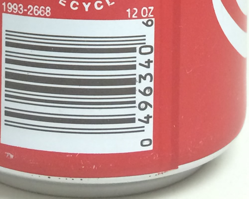
That’s where the dark red - You’ll see a dark seam. That’s where the plate hits itself a second time.
Some of these are what they call “white coat” cans, where they run them through the press one time in white. That adds a fifth color by doing that. So, they run it through once in white and then they over print over top of that after it has been fired and cured with another set of colors so they can go up to five colors. That’s a way to “cheat” the system. You’ll notice it gets more of an appearance of like an aerosol can in that it is more clean. White looks better. Sometimes they can do a double hit of white so it becomes more opaque.
For the most part all these whites are pretty much grey and therefore the colors that are applied over top of them have a grey tinge as well. They are not completely opaque so they’re always kind of have a metallic sheen to them. So if the customer wanted a 485, it was 485 with an element of grey involved. And if they didn’t like that you would try to find something that looked like 485 but it was another color over foil and it was kind of complicated. And it didn’t need to be, but it was.
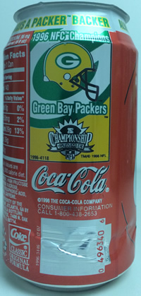
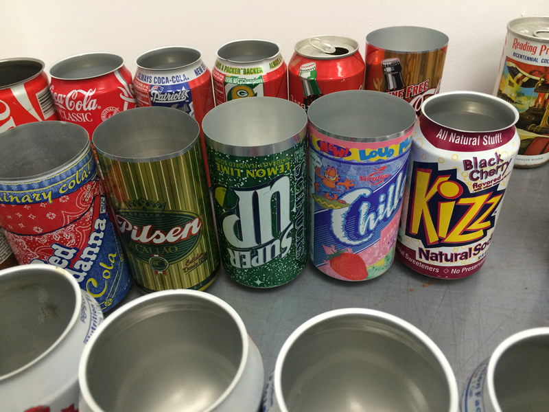
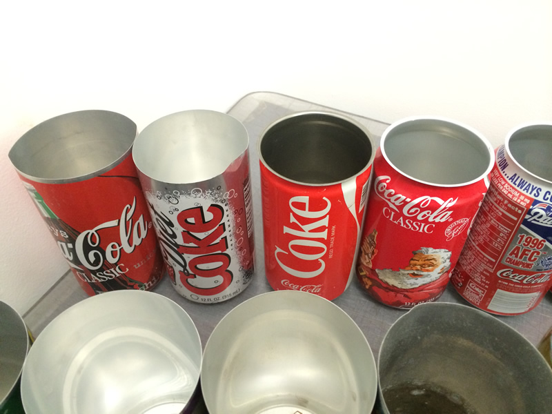
Here’s a Coke can that was done for a championship game. It’s the Green Bay Packers. Typically, what would happen is in a playoff situation you would get the art for both winners and losers.
CanMuseum.com: (laughs) OK.
Paul Adler: You’d have two sets of winning cans ready to go regardless of who it was.
CanMuseum.com: Oh, so they were made already?
Paul Adler: The negatives or printing plates would be made and then the next day they would be ready to just turn the press on and do whoever won. Sort of like you think of that election, when I think it was Truman and Dewey or whatever that was that presidential election. They printed the wrong paper. The one with the wrong results.
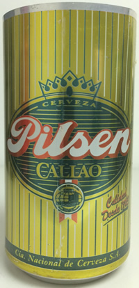 Paul Adler:
 I’m showing you a beer can here that’s got a gold line. Gold just like we do in packaging today for coffee. Gold is achieved typically with a yellow over top of foil to create the illusion of gold.
CanMuseum.com: Interesting.
Paul Adler: That’s how that’s achieved. But you’ll see there’s a stay-away on all those colors. Now I don’t know what the technology is today. They may have different inks and maybe they’ve developed newer ways to do this, but when I look at cans typically see that stay-away still applied. It’s very limited. It’s very crude. Four colors, five at the most if you do an overall white coat and that's the way it goes.
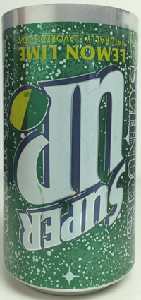
This is one that was printed upside-down. Someone either screwed up or they were trying to do some marketing thing. Looking at the can, they probably screwed up.
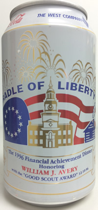
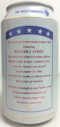
CanMuseum.com: I noticed there were some cans that were custom made like this Boy Scout can.
 Paul Adler:
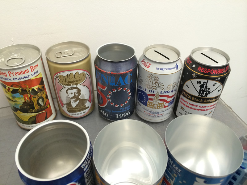
 That was something we did locally in Philly. A company came out and we made them. This one is a bank.
CanMuseum.com: I didn’t even know this was a possibility for companies to custom print cans.
Paul Adler: Yeah, and the can ends were made with a slot in it.
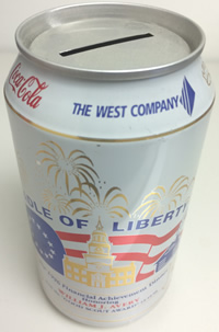
CanMuseum.com: It’s a bank top.
Paul Adler: It’s a bank top, yeah. This one was for the CEO of the company at the time.
This one is for ENIAC.
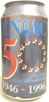
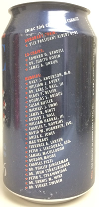
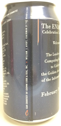
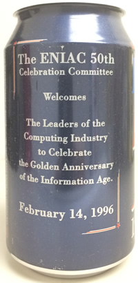
The anniversary of ENIAC which was the first large computer at the University of Pennsylvania. Which basically did what a calculator does today and took up a massive room and was all vacuum tubes like on amplifiers. The term “bugs in the system” came from the fact that they attracted roaches and stuff like that. You literally had bugs in the system.
This is an old steel can.
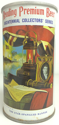
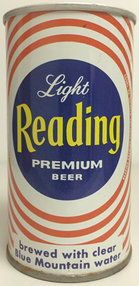
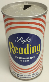
I didn’t print this but I saved this because it was really cool. This was before they used aluminum for cans. You can see the walls are straight. What they wanted to do was - all the money is in the top. Thats where the highest concentration of aluminum is. There is probably less in the can than there is in the top. So they constantly wanted to make this smaller. So originally when they made these cans, the lid went to the very edge. Then they gradually tapered it and tapered it and tapered it. This is a 206 diameter. This is a 202 diameter. I think they are currently still at 202. They can’t get much smaller, I guess, currently because it will bust or break. This ridge on the bottom - not only does it help the can stack, but it is designed as a feature to protect the can if it is dropped. I think they designed the fall from 5 feet up. Sort of like in a car, they put in a nice little detail into the side of the car - into the edge of the metal - but it also provides some sort of strength as well.
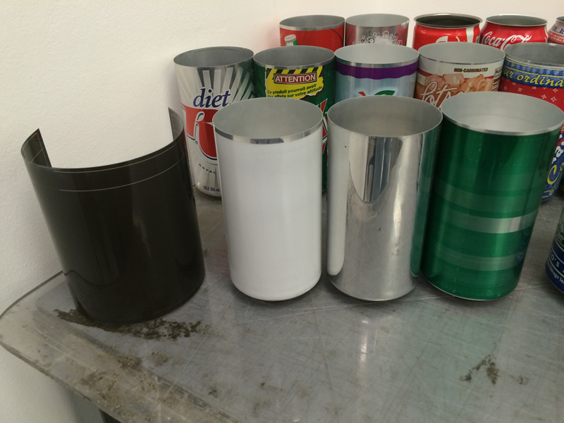
CanMuseum.com: There’s a couple over here that don’t have designs on them.
Paul Adler: They were test cans.
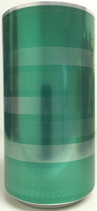
This is a screen test they did to see what the green would look like at different levels at different screens. They wanted to figure out - one way to cheat if you want more than one color - if you make a screen and you go at 100% of the color and then you go to different percentages lower of dye and it creates a different look. So you can kind of get away with some stuff. The only problem is that - and it stays true even in the packaging place we work at here today - when you get into the lower screens, sometimes the ink starts to fill in or the ink bridges between the dots so the tendency is to pull back on that ink or thin it out or whatever means necessary. Then the darkest color will suffer and lighten up. So that becomes an issue and that’s the difficulty in using screens.
This is a can that just goes in the press without being printed. They refer to that as a “silver bullet”.
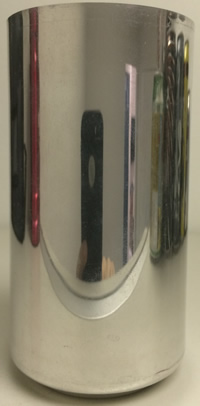
Coors used that for their cans over the years. They did a very minimalist design.
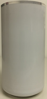
CanMuseum.com: And this is the white one.
Paul Adler: This is a “white coat” without any printing on it.
CanMuseum.com: And this…
Paul Adler: This is a negative with a dye line on it.
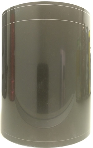
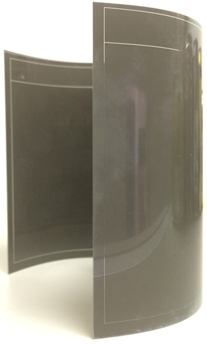
I don’t know why I had it. Our end product where I worked was making negatives. We sent negatives to the printing plant. They would take that and put it into a machine and they expose it to a photo plate underneath for a certain amount of time. The areas that were knocked out is where the light would go through. That would harden and all of the other areas would wash off in a chemical wash. That’s how you made your printing plates.
That is similar to what goes on today in all forms of packaging when we do flexo printing. There’s a chemical wash that takes place and today they use lasers to expose the film and the photo polymer.
CanMuseum.com: When did you work at Crown, Cork, and Seal?
Paul Adler: 1994 through ‘98, something like that.
CanMuseum.com: I just wanted to ask you that because I’m not sure how they do it now, but back then…
Paul Adler: Yeah, because I saw some cans that Bob gave you, and some of those were wet on wet brand. Some of those are flexo style process dots. So you’ll see there’s some hits on that and it looks like they did wet on wet printing which was forbidden. So they have some technology that’s allowing them to do that. Maybe it’s and advanced ink or maybe the inks that are printing that area are only in specific areas so they don’t have to worry about it contaminating other colors. It think if anything hits white it is probably ruined.
CanMuseum.com: You told me the ink doesn’t really dry.
Paul Adler: The ink never dries, there’s a varnish coating on it. I think the same coating is on the inside because the aluminum wouldn’t hold up to Coca-Cola or something like that. So there’s a coating, it’s not raw aluminum.
CanMuseum.com: That’s right, because Coca-Cola eats through everything.
Paul Adler: Yeah, but it won’t eat through whatever they chemical coat the can in.
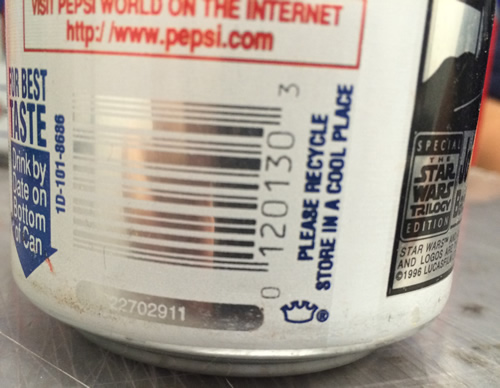
CanMuseum.com: Is there a way to identify a can that came from Crown, Cork, and Seal?
 Paul Adler:
 That would be the Crown Bug that is a little, tiny crown that unless the customer says it can’t be there, it’s on all their cans. You’ll find that same thing with Ball cans and you’ll find it with Metal Container. They have an “M” and a “C”. Ball has the Ball logo. There are all different types of symbols out there. Reynolds had their own stuff. They all have their symbol so they get credit.
CanMuseum.com: Are there any memorable can designs that you encountered?
Paul Adler: When Pepsi changed from their simple design to their complex design that they have today. I remember that. I’m not a big fan of the current Pepsi designs. They were the first people to do all the crazy screens and fades and stuff like that. In the beginning, it didn’t look so good, but it’s OK now I guess, but I like the plain red, white, and blue Pepsi can.
CanMuseum.com: The classic Pepsi can.
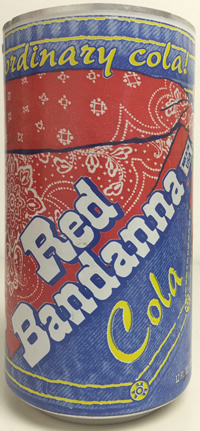
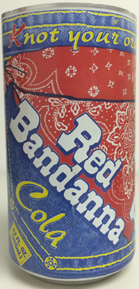
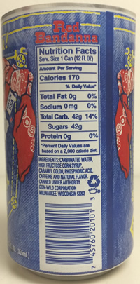
Paul Adler: There were some things. Nothing really stands out. Like I think you have the Red Bandana can?
CanMuseum.com: Yeah.
 Paul Adler:
 That was a white coat can and it was make to look like jeans. The one I gave you is actually a defect. The customer didn’t like it. They rejected it. They went back and printed it with a lighter blue. I love that can. I thought it was so cool.
CanMuseum.com: I don’t think we have any of those in the museum. I’ll put a picture of it in there.
Paul Adler: Wow. That’s cool.
CanMuseum.com: You mentioned to me that you liked the Space Can?
Paul Adler: Oh yeah, I saw that in the office. Which was a steel can with a shaving cream applicator on top of it and it was printed with the Pepsi colors on it. That was used for the space program.
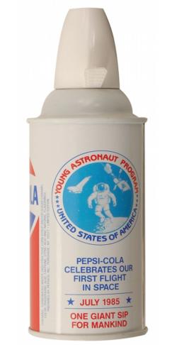
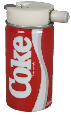
They worked on a whole bunch of other stuff while I was there. I see them out in the market now. They use cans as bottles. That was all secret. They were working on all that while I was there. It was like nobody could talk about it.
CanMuseum.com: You see them a lot now.
Paul Adler: Now they are out there. They were part of that technology - the proving of that technology.
CanMuseum.com: Any on-the-job stories? Any interesting things that stand out that stick in your memory?
Paul Adler: There’s always the graphics stories. Like things that got missed. We proofed everything on plain paper and sometimes if you didn’t give the foil a color it could get missed. If you were looking at white paper, you didn’t know if you were looking at white or the foil because white didn’t print on paper when you were proofing it.
We did a can for Power Rangers that was in Mexico and inside the guy’s arm - he had his hand on his hip - there was a triangle of space. There was no white in there. So when they printed the can it came out with silver there and that was bad. A lot of people were upset about that.
Just like for Super Bowls and World Series, you get 2 sets of artwork. Specifically for the Super Bowl you’d have two sets of artwork so that the next day when you came in whichever won, that was the one you sent to the plants so they could print it. Sometimes they had to send everything in advance and the plants had to run the one that was the winner. We made negatives back then and the negatives got sent to the plant and the plant would burn their own plates from the negatives we sent them. Nowadays I wonder if they even do that. They might send stuff electronically and just have digital plate manufacturing onsite. Who knows?
CanMuseum.com: That’s all I have unless you want to share what you do now?
Paul Adler: Now I work at Fres-co and I am a graphics coordinator here which is what I was at Crown. It’s basically the same kind of process. You “pre-flight” artwork when it comes in. “Pre-flighting” means you’re looking at it making sure it is something we can physically print after it after it goes through our process. We have an imaging department that sets up artwork for printing. What that means is that we have presses here that are 8 or 9 colors. Most presses have a limit to the the amount of colors they can print. They are not like giant laser printers. So, a lot of times customers will send in artwork with 20 colors or something because they have this grand vision of what they want and then reality sets in. So they have to simplify it and dumb it down. A lot of people use process printing. Process is great for pictures, but it’s not good for forming type because it’s 4 colors. In a manufacturing setting, we work in, we print multiple versions of the same thing across and around on the print surface. That means we might do 8 images at one time. Which at times you step away from the first image, depending on when you look at images, there’s room for things to shift. So you want to keep that as tight as you can. People don’t understand that too much.
CanMuseum.com: Do you have any hobbies or anything you do outside of work?
Paul Adler: I play in an 80’s cover rock band called Old School
www.OldSchoolRocksPhilly.com
